U.S. Casualties in WWI
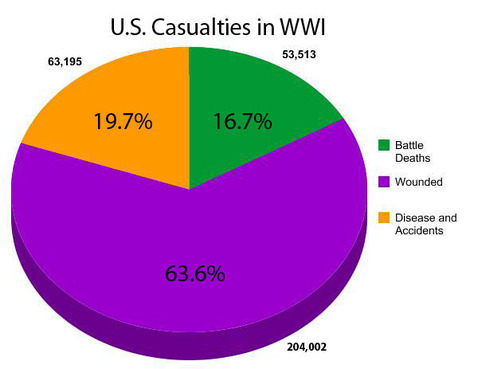
This graph allows the viewer to see the number of deaths that the Americans endured during WWI. It portrays different causes of death and how they compare to one another. The majority of the deaths were from diseases, accidents, or wounds acquired from battle. Few were due directly to dying in battle. This implies the quality and environment of healthcare on the battlefield wasn't effective enough to support the health and conditions of wounded or ill soldiers.
Cost of WWI (Major Powers)

This chart represents the cost of war for the major participating powers. Since Germany, Great Britain, and France had spent the most funds on the war (37.775, 35.334, and 24.265 billion dollars respectively), this would imply their size, power, and economic wealth were greater than that of the other participating powers. It was these funds that allowed them to use advanced weapon warfare such as early submarines, tanks, airships, aeroplanes, and poison gas warfare. The large amounts of money spent by all the major powers demonstrate the seriousness and large scale of the war.
Cost of WWI (Sub-Major Powers)

This graph compares the amounts spent by the lesser countries on WWI. The correlation between the size of the countries and the money spent is well expressed in that it appears that the larger the country, the more that was spent on the war. For example, Canada, the largest country in this graph, spent the most at 1.665 billion dollars while the smallest smallest country, Belgium, spent the least at 1.154 billion dollars. This also can also show how much these countries contributed to the war, as well as their wealth and economic disadvantage in relation to the major powers.
Cost of WW1 (Minor Powers)

This graph compares the amounts spent by the minor countries on WWI. The correlation between the size of the countries and the money spent is well expressed in that it appears that the smaller the country, the less that was spent on the war. This also can also show how much these countries contributed to the war, as well as their wealth and economic disadvantage in relation to the major powers. These war participant had the less casualties sue to the insufficient funding for more soldiers therefore, less deaths compared to the rest of the nations. These were the minor powers that were highly affected by the war due to their small land masses (that may have been war prizes) and their lesser military and economic position in comparison to the other countries.
Casualty Breakdown of WWI

This graphs compares the number of casualties of soldiers during WWI. The greatest numbers of death belong to the largest powers of the war; this enforces the idea of how large the armies of these countries actually were. The large scale and numbers of these deaths show the intensity and the hostility of this war. Russia had the most wounded which would've likely affected its agricultural economy, since fewer people would be able to work th fields. Germany had the most soldiers who had died which demonstrates the strength of the opposing forces although this could also be due to the large amount of soldiers Germany had in comparison to the other countries. In comparison to their initial number of soldiers, Austria-Hungary had a 90% casualty rate, giving an idea of the amount of blood shed in the war. Referring to the grand total, more than half the soldiers (from all sides) had become casualties by the end of the war.
Other Charts

This chart shows the productivity and constant changes in female employment from 1914 to 1920. From the chart, women were more prominent in working under commerce-related jobs. Commerce would include trading, bartering, and general provisions for the communities they belonged to. The chart gives an idea of the necessity for female workers in that while their husbands, brothers, and fathers were off to war, they maintained the economy of their towns or cities by taking on the jobs of the men. With the men off to war, the women would take the roles of men to maintain the standard of living that was primarily made by the males in pre-war life. The percent of women working after the war was lower than during the war, but still higher than the percent before the war, implying women were slowly beginning to integrate into the workforce and therefore gain more freedom in doing so.
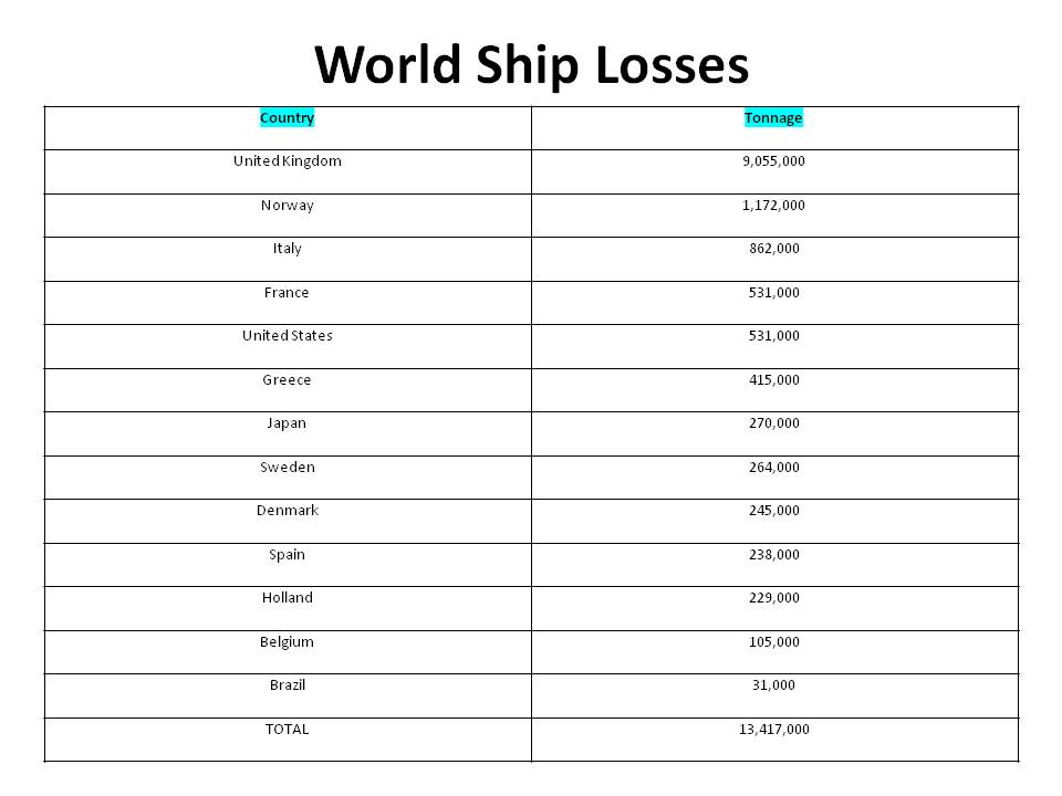
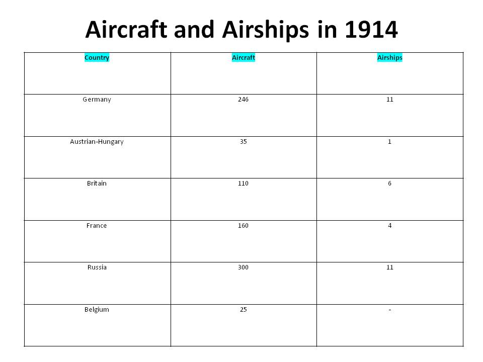
During WWI, the participating powers, as shown, lost a lot of tonnage (cargo carried by ships.) The United Kingdom had the most tonnage lost during WWI as opposed to Brazil, who had 31,000 tons lost. The large amounts of cargo lost (totaling 13,417,000 tonnage) were directly due to the constant naval warfare from both sides. There were massive amounts of torpedoes and gun fires (primarily from Germany with their U-boats and from major naval fleets) that were in contribution to these numbers. This shows the effectiveness of weapons and therefore, the advancement in technology in naval war craft. New militaristic strategies and technology show how the countries conquered one another and the superiority of stronger countries over other countries. The chart of aircraft shows the advancement of technology and aero-warfare in WWI; it also shows how Germany had the power and money to fight in the air as it had the most aircraft constructed. This would eventually lead to advantages during the war and the development of better weapons and vehicles. The aircraft from WWI set the foundation of future aircraft soon to come.
